


Colour is the major characteristic of architecture being the visual perception of the human eye. The cone cells deliver us different colours and in turn colours deliver us different moods. Colour is a sensation produced by the nerves with the presence of light. Colour is proportional to architecture and both together is proportional to the way we live through the space with colour inside. Colour creates moods and emotions owing to these characteristics, designers use it wisely for the creation of an appropriate atmosphere in a given space. Colour is not just a decoration element but an integral element in the living environment, it is a language which is internationally spoken in architecture and is the most mysterious influence in design.

Our lifestyle choices are revealed in our own homes through colour as it has the most direct effect on our expressions and emotions, from making us feel happy to sad, from relaxed to energetic, it plays a vital role in psychology of the human brain. Holding a major responsibility in psycho-spatial relationship, the mood and the ambiance of the space depends upon the impression of colours used whereas the function of space depends on the type and use of the building. The experience of the person in a living space is influenced by the application of colours on the architectural elements showing volume, details, aspects of space, visual effects. Architecture and Colour should exist in harmony in order to conceive a visual space. Usage of colours in architecture has evolved in years, from cities depending on their natural materials delivering a vernacular look to the cities painting them blue to keep the mosquitoes away.
Electromagnetic waves recorded by our eyes and brain is what we call colour. Colour, a feature of light enthrals the being, various diverse feelings and emotions that communicate with our internal system and mind. The right mood in interior designing can be easily obtained by mastering the colour theory, each colour has different impacts on people differently, one’s culture, age, race, and life experiences are influenced by colours. Colour reacts in three elemental approach one is active, other being passive and the last being neutral.

Colours are mostly divided roughly into two types as cool and warm colours. Green, blue and purple which are largely associated with peace, calm and harmony falls under the cool colours category whereas the warm colours are red, orange and yellow which evoke feelings of emotions, passion and even anger. The palettes of Triads, Complementary colours, Monochromatic colours, Analogous colours, Cool colours, Warm colours and the Non-colours are the evolution of colour collection in designing. All colours in the living space can be easily matched in accordance with respective taste, desire, purpose etc.
Light colours make the rooms seem bright and large thus, in turn, being airy and spacious whereas dark colours give the more intimate appearance to the spaces thus, in turn, being warm and sophisticated. Certain colours create specific sensations; as in bedroom can be calming and be in blue, bathrooms can be waking up with yellow, kitchens as in firing with red and a whole lot of rainbow smashed inside the kid’s room. Each colour is different as they hold various terminologies quoting their emotional associations.
Starting with different colours and their impact on them through architecture seen visually by us.

The natural whites, greys, blacks are the monochromatic, serve as the minimalistic statement, its usage achieving modern elegance. White expresses purity, enormity and it is the coolest of colours. It can be used positively in multiple locations that enhances light and emphasizes the space illuminating it. Traditional spaces, the circulation points such as the corridor, living room, balcony or a sit out in natural light so it is appropriate in using monochromatic colours. Certain spaces both exterior and interior need the simplest treatment in terms of texture and colour. Pale yellows, greys, off-white and cool whites create a sense of luxury, elegant modernism can be practiced while painting the floor black with the simplest distribution of furniture. These pale colours help in unifying the various spaces and rooms.

Moving from the neutral feel of monochrome to the feel generators of bluish moods and violets. Blue delivers the feel of positivity, confidence, is been largely used on the interior the exterior as it enhances the space and the light. Blue and its hues create an association with life on the coast as it is a dramatic splash of colour emphasizing specific features. The combination of white and blue in the exteriors as well as the interiors creates freshness of the space and brightens it, belonging to a versatile family produces various different effects in the space and on furniture slightly delivers the comic effect. The pale blues often brings peacefulness and soothing feel from casual to formal and is largely used in business and commercial spaces.

Moving from bluish moods to the colours of luxury the richer reds and pale pinks, the colour of visual drama. Being the most aggressive and assertive colour is red whereas the softer side of red are the pinks. Red shows energy, impulse, danger, excitement and its usage in commercial companies and food outlets are marked to be on point. Red deliver a sense of luxury as well as surprise and shock when it creates the points of focus and interest in environments, visual excitement is attained by just placing a red rug while shades of pinks convey a sense of equanimity. In some cultures, red is the colour of happiness, inside bedrooms bring intimacy and outside to liveliness. Dark reddish browns carry the implication of comfort and it is warm and welcoming. Brown highlights are seen in the form of bed linen, picture frames, cushions, lamps, etc adding luxurious grace to space.
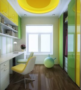
Traveling from rich reds to the citrus sun lights of yellows and greens, the illumination power of the interior, giving freshness to the space and expressing the bounty of nature. Yellow portrays bright atmosphere, optimism, sunny impression and appears cozy widely used across restaurants. Palettes of greens and yellows indeed stand out as a dominant interior feature, varying shades of yellows create a luminous atmosphere and warm toned yellows associating the crockeries. In order to create a pleasant living environment, the combination of display of interesting objects and colours need not to be confined to the principal of the living spaces as yellows are positive colours. A return to the greens, adding elegance, evokes calms, serenity and well-being, usage revolving around hospitals, relaxation centers, etc as these spaces are associated with well-being.
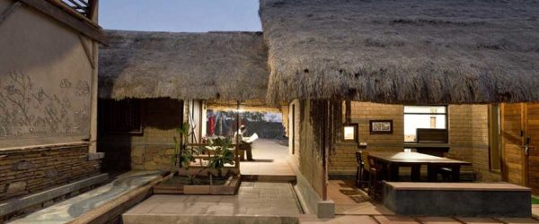
Moving from blues and greens to earthy feel colours of nature and neutrals, that compose the visual aspects delivering the feel of earthy relaxation moods. These neutral colours are attained by mixing certain complimentary colours with each other, these down to earth colours are directly obtained from the earth, these neutral colours serve as backgrounds, show stoppers, furnishings when it falls in architecture and elaborates its action on vernacular. This palette of colours is used largely on rustic houses on the exterior and the interior delivering a pale outlook, they do not easily fit into the primary colours and material applications. These assertive colour treatments are seen in wooden panelling, terracotta, wooden furniture, etc. This beige, cream, brown are the primary colours of rough textures that characterize oldest houses. These earth tones are seen through the lens of nature that are potential for experiencing lively living, these neutrals bring the feel of naturalness. These natural colours obtain their shades widely from natural materials like stone, clay, wood and even dried leaves, they have a timeless decorative vitality all of their own. Local forms, local architecture, local colour, local materials all these examples somehow combine these elements in a particularly convincing and intimate way, these colours in the interior bring great opulence in a house. The subtle interplay of outside light and deep colours of the interior is the fundamental strategy to the charm of a traditional house.

These are the various colours delivering various moods and showcasing various aspects of spatial visual combinations in architecture. Colours have a great impact on how you feel and act, and it proportionally plays in such a way it can be intimated through architecture and interior designing. Impact of colour in accordance with appearance, form, scale, the texture is the important characteristic of building design. Colour can be calm and soothing as well as arresting and vibrant, each individual is born with their own personal response to colours. Colour is personal, colour is powerful; each individual has their own unique colour palette played with their perception of need in perspective of architecture.
Local construction is Vernacular architecture, outlined by the use of locally available materials, practices and knowledge. Being practical, local...

Ventilation in architecture, the procedure of replacing or changing the existing open space in any place with fresh air...
Light, the portion of the electromagnetic spectrum that a human eye is able to grasp. The art of designing...